Mastering the Cafe Colour Palette for 2026
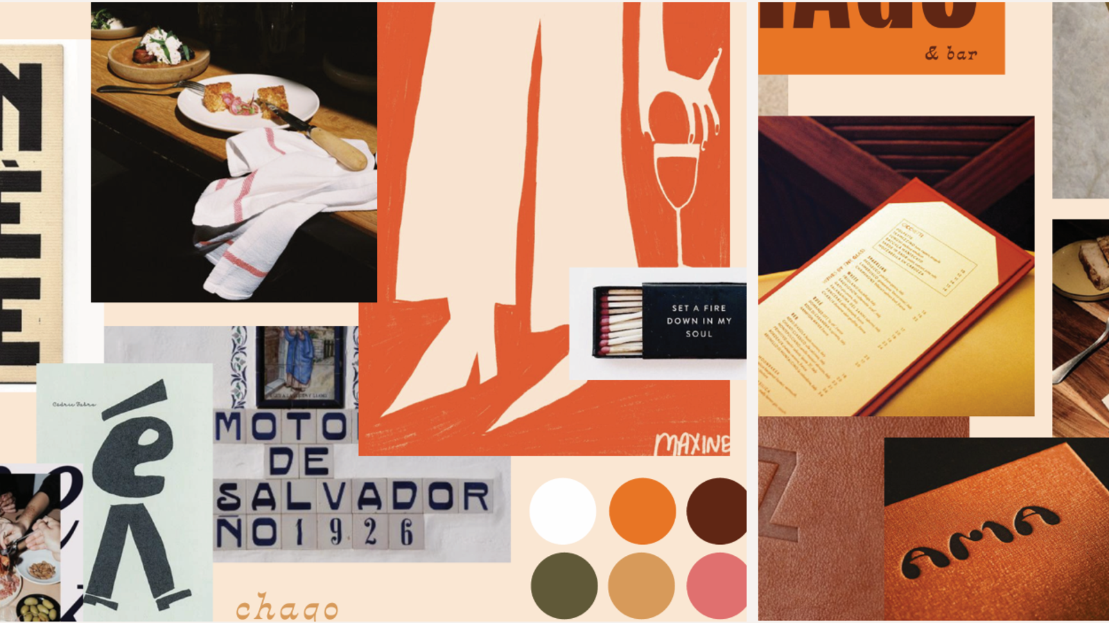
In the competitive landscape of the Australian hospitality industry, a successful cafe business is no longer defined solely by the quality of its coffee. While a perfect pour is essential, the modern patron seeks an experience that is expertly crafted, functionally inspired, and emotionally resonant. At Studio Hiller, we believe that the journey from a vacant shell to a thriving destination begins with a single, pivotal decision: choosing the right colours.
Selecting a cafe colour palette is a sophisticated exercise in psychology, brand storytelling, and operational strategy. It’s the visual language that speaks to your customers before they even take their first sip. Whether you are launching a new project in the heart of the Sunshine Coast or revitalising a coastal brunch spot, understanding the nuances of a colour scheme is the key to creating a space that doesn’t just look beautiful; it performs.
The Psychology of the Best Colour Scheme
Before we dive into the paint swatches, we must understand the "why" behind our choices. In the food service industry, colour palette selections serve as a silent invitation. The best colours are those that align with your specific business goals and the unique coastal or hinterland environment of your cafe.
Stimulating the Appetite with Warmth
In alignment with the 2025 Dulux Colour Forecast, we lean into the visceral power of environmental psychology. By incorporating grounded, earthy tones like rust and terracotta, we do more than create a beautiful room; we tap into a well-documented sensory response that heightens the appetite and elevates the entire culinary experience.
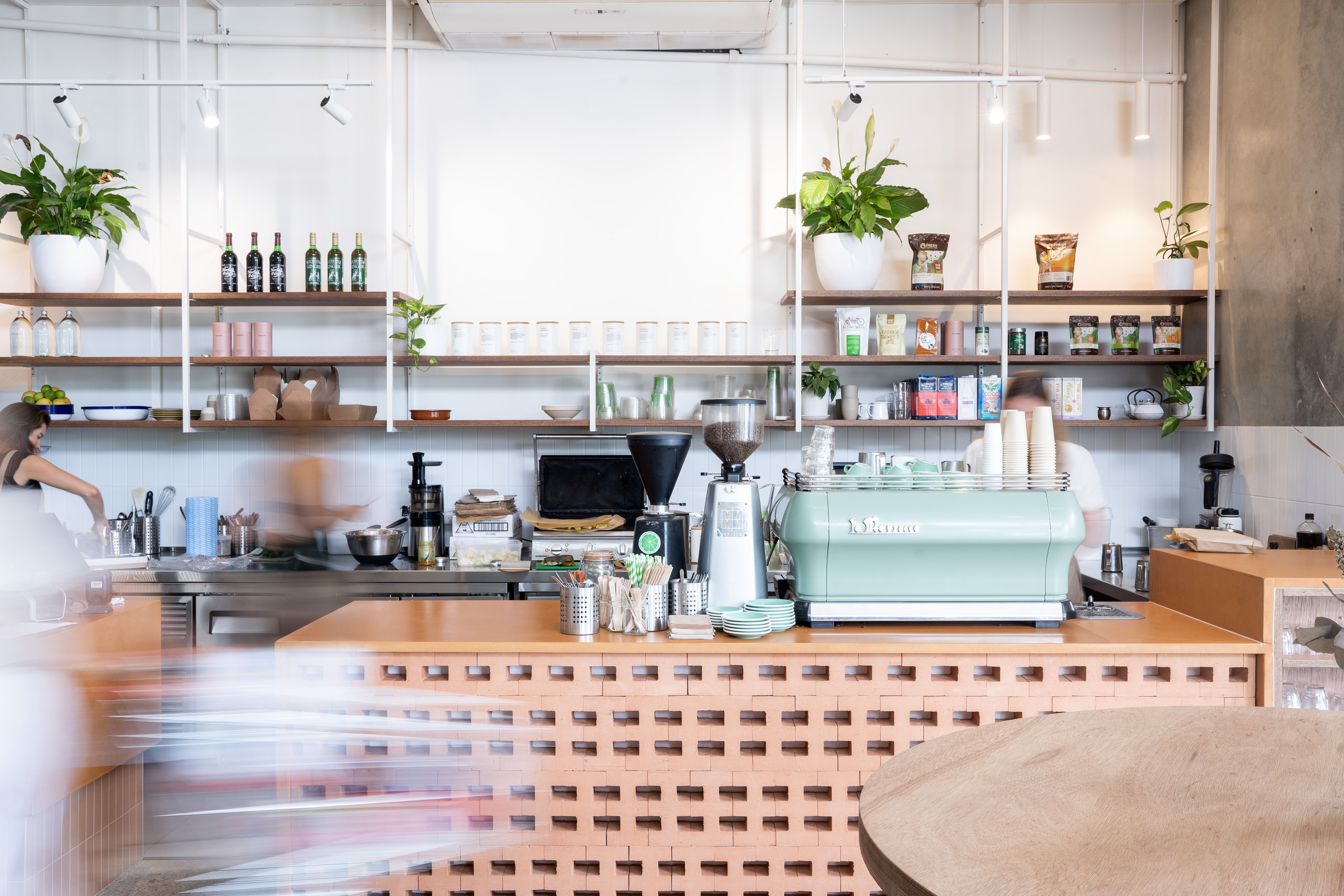
A prime example of this is our work at Organika, where we utilised terracotta tones and clay breeze-blocks to create a grounded, organic feel. This cafe's colour palette doesn't just look modern; it resonates with the health-conscious identity of the business, making the space feel both high-energy and deeply authentic.
Encouraging the "Stay" Through Nature
If your coffee shop model relies on people lingering over a second cup or a pastry, your cafe colour palette should lean into the "restful" end of the spectrum. Muted greens and soft blues, often found in nature, lower the heart rate and make a room feel spacious and calm. When these are paired with natural brown timber furniture, you create a sanctuary that people are loath to leave.
Localised Palettes for the Sunshine Coast
Drawing from the 2025 & 2026 Dulux Colour Forecast, we are seeing a definitive shift toward Regional Minimalism and Heritage Revival. These trends represent more than just fashion; they represent the changing way we use public spaces on the Sunshine Coast.
1. The "Still" Palette: Japanese Minimalism
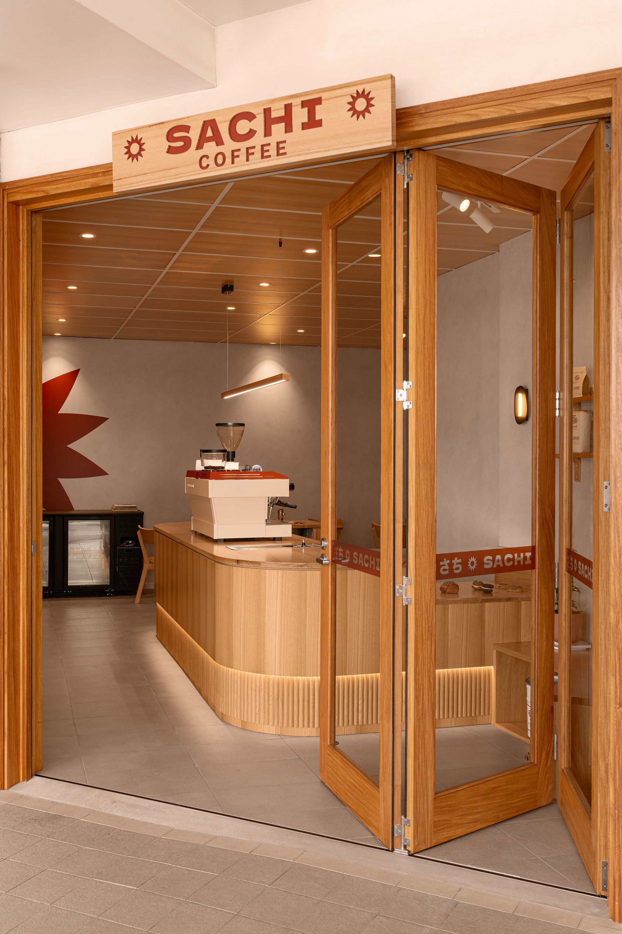
The "Still" colour palette is the ideal choice for high-end "slow coffee" bars. It prioritises white, creamy beiges, and lighter stone greys. We brought this concept to life at Sachi Coffee in Caloundra. By choosing a colour scheme grounded in natural timber and textured specialty paint, we transformed a challenging angled tenancy into a quiet sanctuary. This best colour scheme works by stripping away visual noise, allowing the craftsmanship of the furniture and the aroma of the coffee to take centre stage.
2. The "Recollect" Palette: Old-School European
In a world of digital transcience, people are craving stability. The "Recollect" cafe colour palette utilises rich burgundy, deep olive, and dark plum. Our project at Moonstruck in Noosa Heads is a case study in this "Heritage Revival." By utilising otsumigaki rendered arches and marble mosaic floors, we created a space that feels established and premium. The use of a warm, atmospheric colour scheme ensures that the venue transitions seamlessly from a morning coffee sanctuary to an intimate evening gin bar.

3. The "Coastal Hybrid" Palette: Sun-Drenched Noosa
For venues along the Noosa Esplanade, the cafe colour palette must compete with, and complement, the natural beauty of the river. At Depot Noosa, we utilised a colour palette that acts as a canvas in contrast to the blue-greens of the water. With notes of Arizona-inspired styling paired with raw and polished materials, the space feels open yet cocooned. This balance of colours is essential for a venue that needs to catch the sun and still feel sophisticated after dark.
Designing the Space: Walls, Furniture, and Flow
Creating a bespoke interior requires a holistic view of the room. A cafe colour palette isn't just about what goes on the walls; it’s about how every element, from the furniture to the lighting, works in harmony.
The Foundation: Walls and Texture
Your walls provide the canvas. For a small coffee shop, lighter colours are important to make the space feel larger. However, a bold cafe colour palette on a feature wall can create an important focal point that guides customers toward the counter. We suggest using textured finishes, much like the refined aesthetic seen in our French Patisserie project, to add depth without clutter.
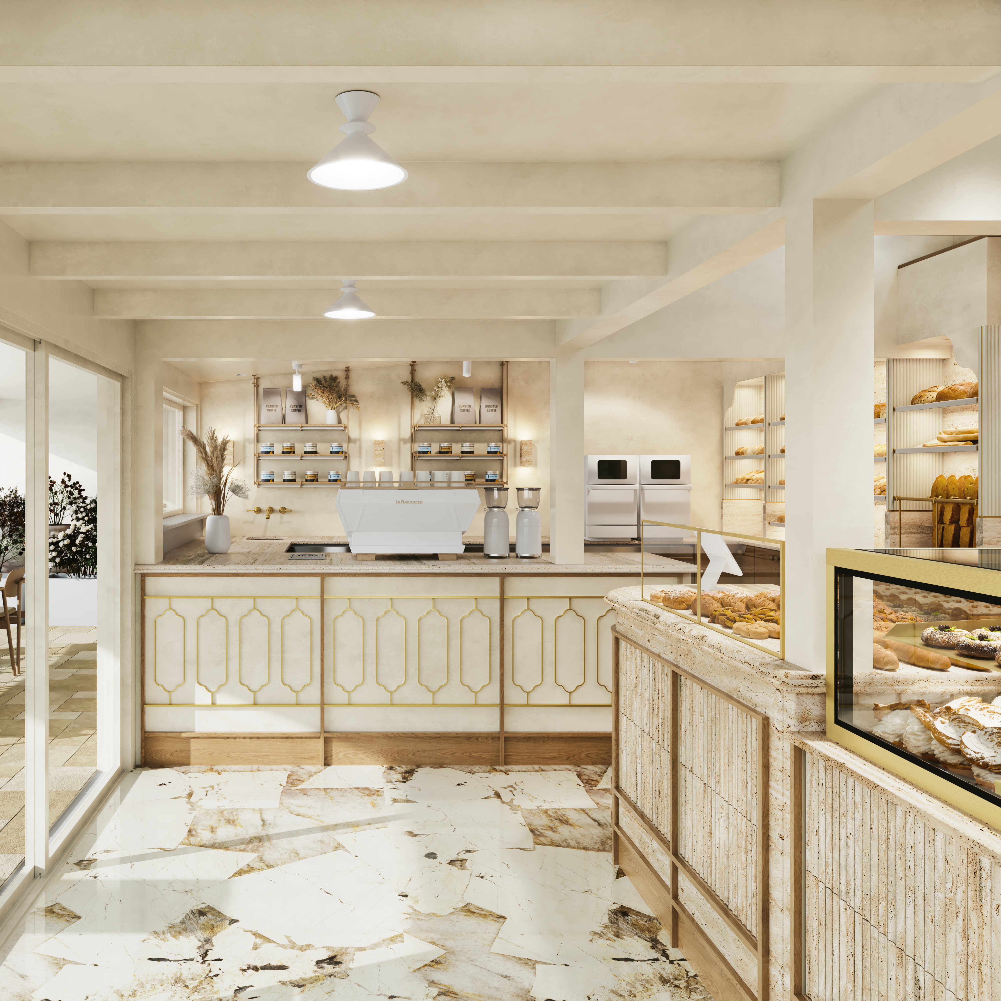
The Texture: Furniture and Custom Details
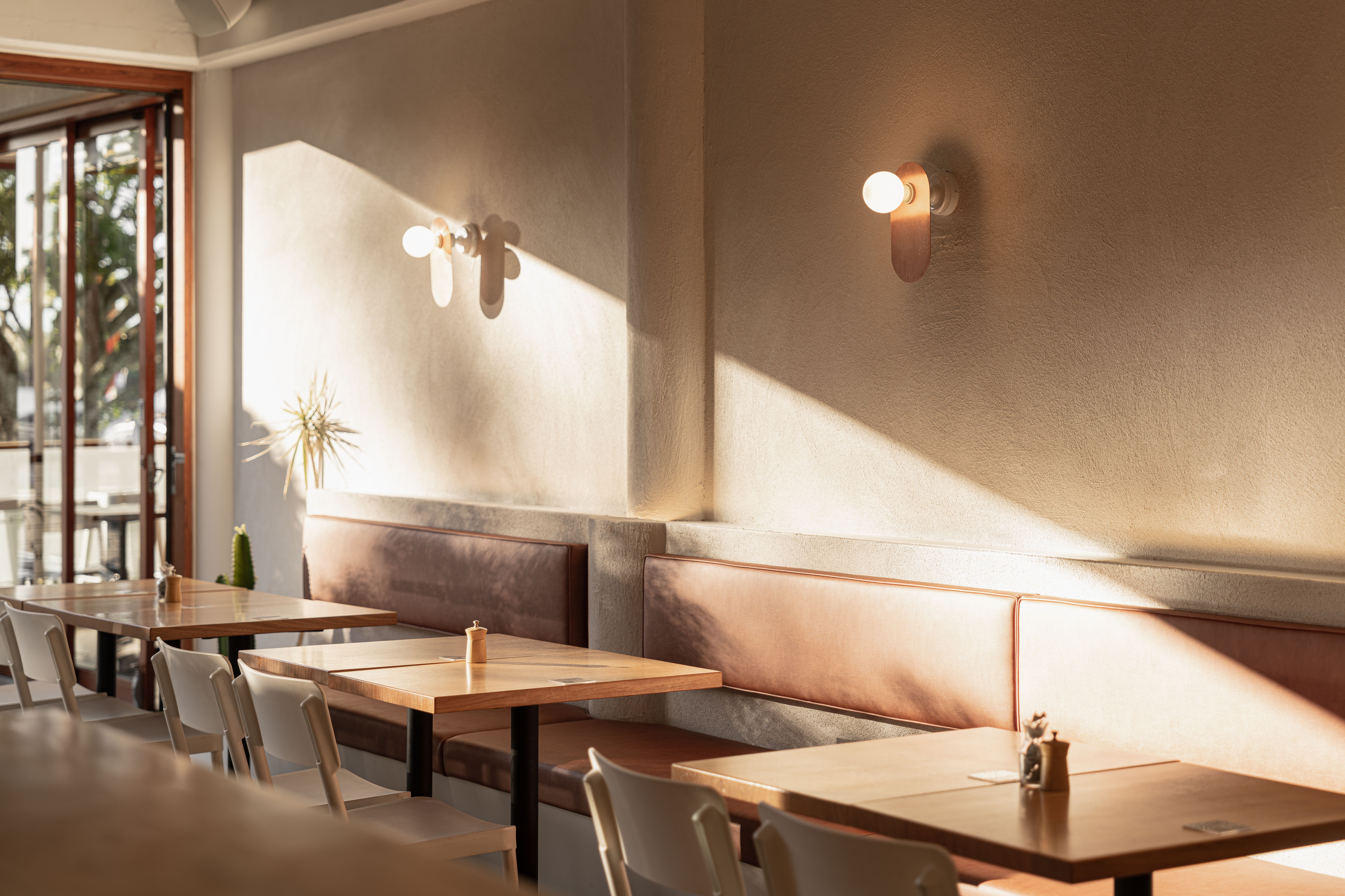
While walls provide the canvas, your furniture is where the cafe colour palette truly becomes a tactile experience. It is the bridge between visual style and physical comfort; for instance, the inclusion of a rich brown leather banquette immediately anchors a room with luxury and warmth, especially when paired with timber tables that invite a touch of nature indoors. At Studio Hiller, we elevate this further by layering diverse textures, much like the bespoke eucalypt composite concrete we utilised at Moonstruck, to add a sophisticated depth to the project.
Essential Tips for Choosing the Right Colours
Making the final choices for your cafe colour palette can be daunting. Here is a brief guide to ensure your project stays on track:
- Consider the Coastal Light: A colour scheme that looks great in a sun-drenched Noosa storefront might feel cold in a hinterland space. Always test paint samples at different times of the day.
- The 60-30-10 Rule: To achieve a perfect balance, use your primary colour for 60% of the space (usually walls), a secondary texture or colour for 30% (furniture and flooring), and a bold pop for the final 10% (branding and decor).
- Operational Efficiency: Darker colours in high-traffic areas are a smart business move. For example, at Depot Noosa, we modified existing tile floors to blend with polished concrete, ensuring a finish that is both sophisticated and easy to maintain.
- Think About the "Gram": While we design for the physical experience, a unique cafe colour palette serves as a visual sign of your brand, making it easy for people to share their experience online.
The Studio Hiller Edge: Functionally Inspired Design
At Studio Hiller, we don't just follow trends; we create environments where your cafe business can thrive. We understand that a cafe colour palette must do more than just look pretty; it must work. It must assist the flow of service, ensure the comfort of your customers, and reflect the sophisticated nature of your brand.
Whether you are seeking the best colour scheme for a high-turnover takeaway spot or a lush, welcoming restaurant, our team of experts is here to transform your vision into a reality. We take the complexity out of the design process, providing a seamless journey from the first mood board to the final coat of paint.
Designed. Built. Thought. We are ready to bring your next project to life on the Sunshine Coast. Let’s chat! Contact us today.